Nonprofit Marketing Booklet and Direct Mail Design
BOOKLET COVER DESIGN
INTERIOR PAGE LAYOUT
PREPRESS
CONCEPT DEVELOPMENT
CREATIVE DIRECTION
PHOTO EDITING
PREPRESS
Drawing upon my extensive background in print design, I had the unique opportunity to flex my creative muscles and explore the realms of innovative die-cuts and captivating packaging. This project, a direct-mail piece for the esteemed National Association of Corporate Directors (NACD), presented a compelling challenge: to craft a piece that would capture the attention of discerning corporate directors and leave an indelible impression.
It would be a folder with a removable booklet aimed at increasing membership in NACD. The folder had to make an instant impression that would compel directors to open and peruse the material. Yet the design also required subtlety, as this audience prizes vigilance and thoughtful consideration before making decisions.
I started from the first thing recipients would see – the folder – and created a design that would meet the above aesthetics and several practical considerations: folded, die-cut (custom cutout shapes), and appropriately sized for non-profit mailing requirements. I had NACD's brand colors to use, but the rest was up to me.
I first took a hands-on approach, literally. I physically created mockups from Xerox paper and scissors, experimenting with all kinds of folds and die-cuts. I wanted the final product to be strong enough to hold the booklet but also feel comfortable in the hands.
I decided the folder would be a "short fold" – the front is slightly shorter than the back – taking advantage of the contrasting blue and yellow brand colors to capture attention and encourage opening. I also included a 'belly band' effect. A belly band is a strip of paper that wraps around printed pieces to keep them all enclosed together, but in this case, I only wanted the appearance of a belly band. The actual closure was an interactive, eye-catching mylar (shiny) silver reusable, non-tearing sticker.
Once I'd created a design I was happy with, I rendered it in Adobe Illustrator®, printed it, cut it with an X-Acto® knife, and fine-tuned it with my Galaxy gauge. This level of detail was critical because this was a direct mailer for a non-profit, and it needed to meet bulk mail size requirements.
Keeping in mind the clients' traditionalist target audience (compared to a lively one) (link to an EdTrust project), I designed the folder cover with the client's branded blue color dominating and a splash of yellow for contrast and a touch of excitement. I used the brand's yellow for the interior because yellow is known (link to color theory blog post) to "brighten the brain," so to speak.
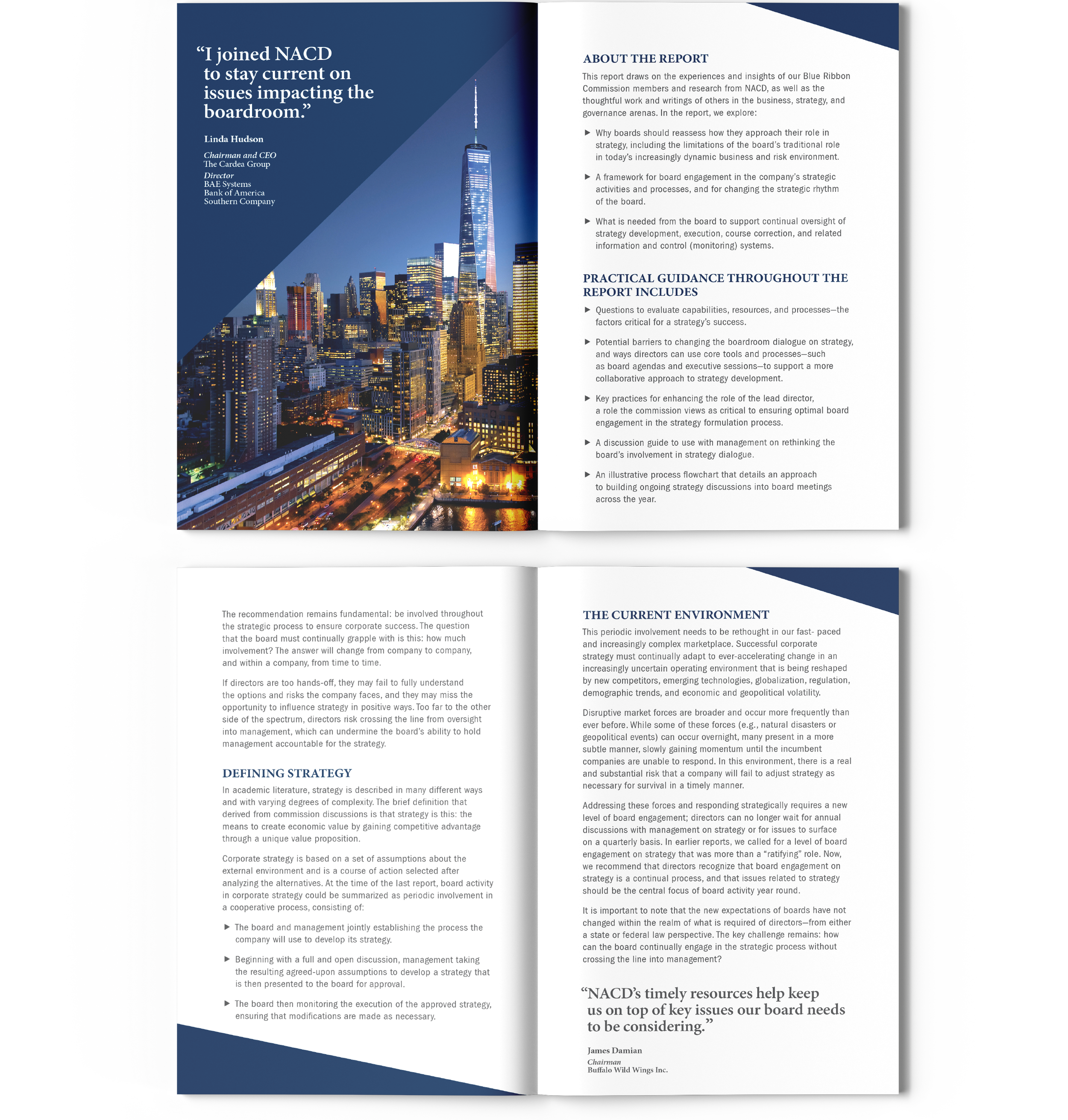
I employed angles and arrows throughout both pieces to subliminally reinforce the brand's logo and direct the reader's attention. I created a triangle pointing towards the closure on the cover, and the interior pocket is also angled. For the booklet, I used angled backgrounds for the quotes, and the copy features arrows as bullet points.
I love working with photos, so selecting the images for this project was a pleasure. The globe image for the backgrounds evokes the phrase "world-class boards" used in the text, and the booklet photos were selected to complement the blue and yellow theme.
The final step was critical – these mailers were sent in clear envelopes to make an instant impression and entice recipients to engage with the material.


