
Designing for Equity: Nonprofit Annual Report Design
REPORT COVER DESIGN
INTERIOR PAGE LAYOUT
CONCEPT DEVELOPMENT
CREATIVE DIRECTION
PHOTO EDITING
My nonprofit client of 5 years sought a captivating annual report design to champion their cause, educators, and sponsors.
The Challenge
Teach Plus, a leading nonprofit education organization on a mission to provide authentic equity-driven leadership for educators across the U.S., needed a showstopping annual report design that showcased its work to valued stakeholders. Viewed as a critical marketing tool, Teach Plus relied on me as their trusted design partner of five years to create an annual report design that shares vital statistics highlighting successes while inspiring continued support from donors.
Achieving the right report design was crucial to making a strong impression and adequately conveying the profound impact of Teach Plus’s mission. However, distilling a year's worth of activities into an engaging, celebratory report on a tight three-week timeline presented considerable creative and technical challenges.

The Approach
I understood the client’s goals, target audience, and key messaging through collaborative conversation and strategic thinking. In turn, I identified their desired tone—bright and lively—as representative of the organization’s brand and the spirit of all the people they serve.
Establishing a cohesive design direction was paramount. Using the organization’s existing branding guidelines as a foundation, I conceptualized two contrasting design approaches that could bring uniformity across the report's layout, typography, and graphics: one photographic-focused and another more typographic.
By presenting dramatically different creative report designs, I provided the client with a clear juxtaposition to make an informed selection aligned with their goals. The client expressed a strong desire to showcase the ‘human element’ at the organization's heart. So, we collectively agreed that the photographic-focused report design would provide a more powerful opportunity to shine a light on what matters most to the organization—the teachers and students.

The Design Solution
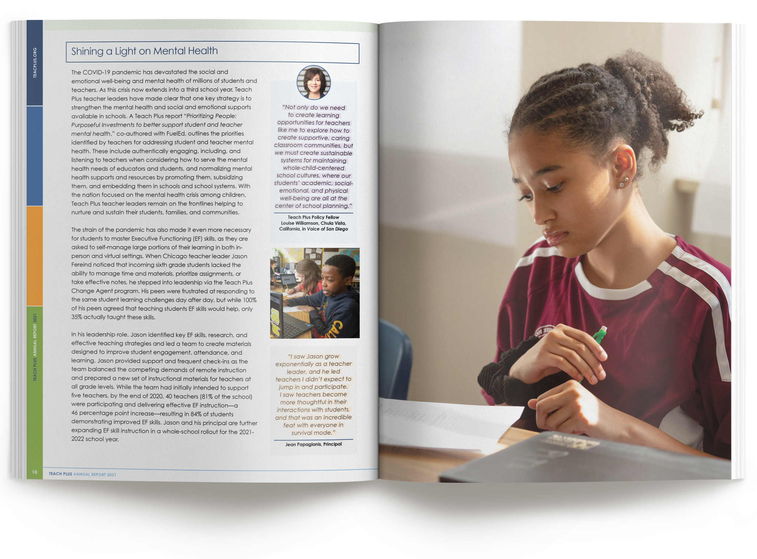
The vibrant cover featured a large photo of two high school students with color blocking, smaller photos of teachers and students, and Teach Plus's branded colors arranged in a grid layout. This established an energetic, cohesive look that carried through the interior pages. The cover aimed to make an immediate impact, highlighting Teach Plus's diverse reach while setting an upbeat, modern tone.
Interior page designs utilized the cover's box grid for headlines and color blocking along the margins. Vital information filled the pages, along with inspirational teacher quotes made to stand out with a "highlighted" text effect and accompanying photos. These design choices strategically guided the reader's eye through prioritized content and personal stories.
As an experienced annual report designer, I knew the technical considerations around pagination, bleeds, and printer spreads were vital in preventing costly errors. Careful attention to production details ensured the report design was optimized for a quality printed piece within budget. Full-bleed and half-page photos helped achieve proper printer signatures for cost-effective printing and binding, and thoughtful layout and color blocking of callout boxes organized the content while maintaining a fun, engaging design aesthetic.
The back cover echoed the front's gridded color blocking, providing a canvas for Teach Plus's social icons and logo - one final brand reinforcement as readers finished the report.

The Results
The final product resulted in a vibrantly designed annual report that told Teach Plus's story through energetic layouts, highlighting their work and the people behind their mission. The client raved about how thoroughly the report design hit the mark, promoting their nonprofit to a tee.
This project exemplified my ability to translate an organization's objectives into a distinctive, printer-ready design under tight timelines. My expertise in layout for printer signatures reduced costs while elevating the viewer's experience through engaging design.
Teach Plus's annual report was critical to their fundraising and marketing efforts that year. The positive feedback received demonstrated the power of strategic design to compel audiences and convey an organization's spirit. I was honored to help Teach Plus share their impactful work so effectively through inspired visual storytelling.
